

Hello dear readers, welcome back to a yet another blog. I hope you enjoyed reading my previous blog on Vaastu in our daily lives. In This blog we will try to know about the colors and how they affect our mood, emotions, communication etc.
Usage of colors in interiors is a very important aspect of designing whether it be our homes, offices, malls, movie theatres etc. Mother nature is the best example of an extravagant color pallet. We find all the blues, reds, greens, whites, maroons and several other colors in the nature. From trees, to rivers, to sky, to ladybirds and butterflies all carry these colors and emit positive and soothing radiations. Important thing here to notice is that, the nature has already set a color code for every element.
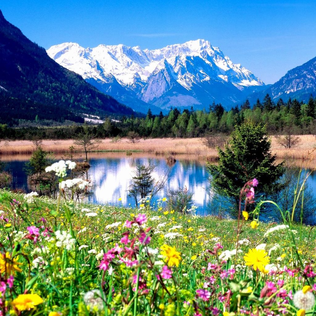
Now just imagine the color of the sky in brown and water in red. Too scary right? Imagine the color of trees and plants in black instead of greens and shades of green? Again, very disturbing. I don’t mean to scare you at all! By now you must have understood the reason behind me, giving these weird examples. For a second at least you must have tried to imagine the way I portrayed the colors in front you. Now for once imagine yourself living in some other planet from where actually the sky looks red and rest everything looks black. Let’s join our hands to thank our beautiful planet and value it more than ever from now onwards. Every color has its significance and we should be able to aptly use them to our requirements.
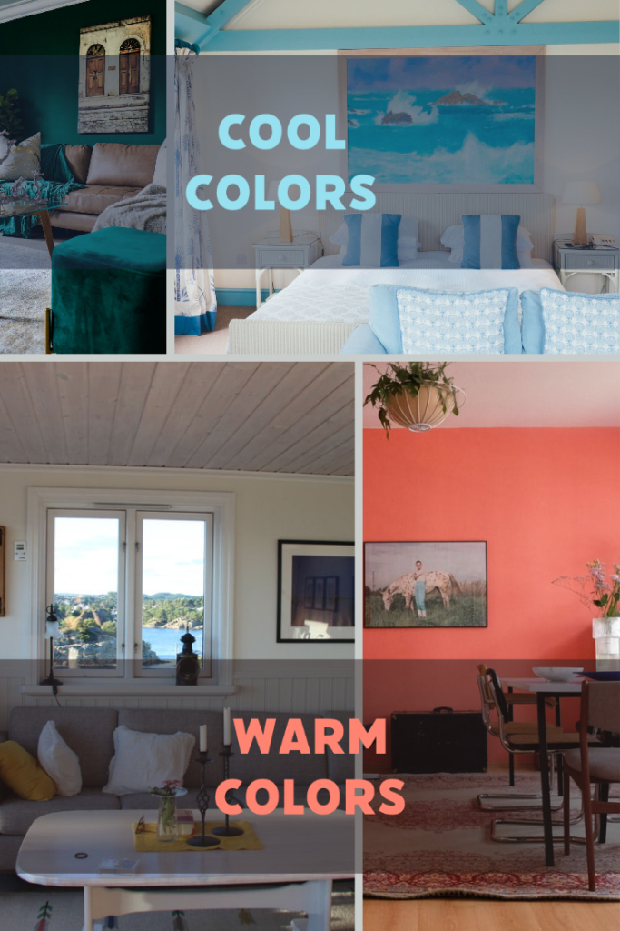
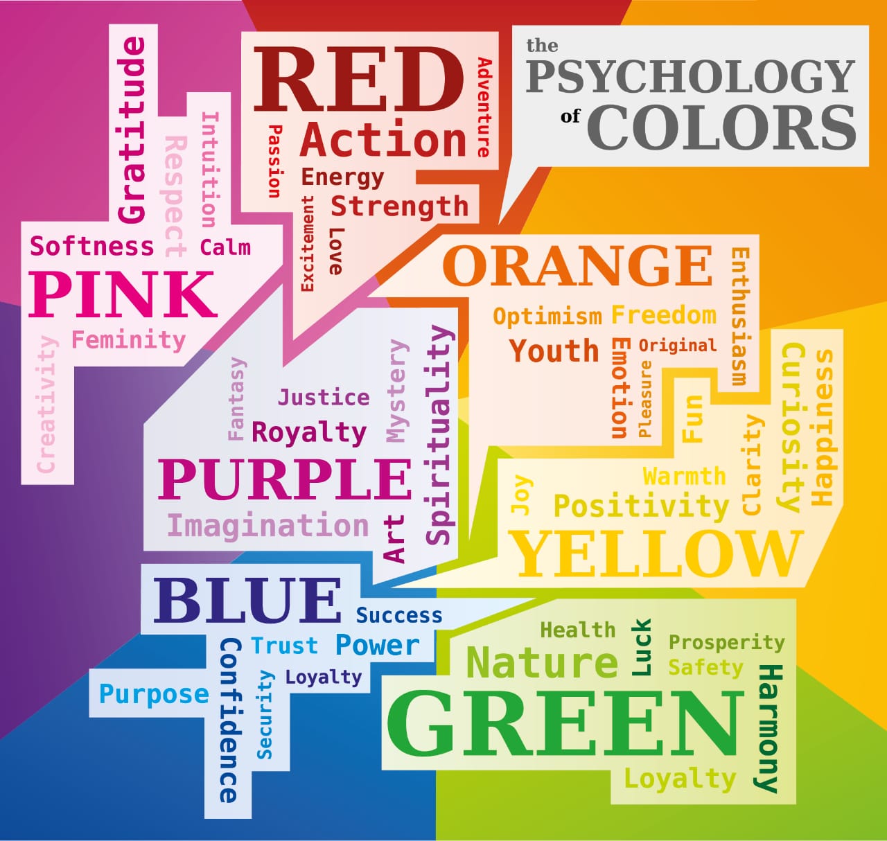
WARM AND COOL COLORS
Colors, have an impact on our mood. Colors and emotions are interlinked. They make us either happy or sad, hungry or relaxed, energetic or tired,
Warm colors like shades of yellow, red and orange are symbolic to hunger, heat and warmth. Hence, we plan these colors in the kitchen or our dining areas. That is the reason why you will find the eating joints mostly stick to these colors for their logo or interiors. These colors are warm colors which evoke feelings of energy, happiness and optimism also for that case, hunger and metabolism. Orange, yellow, red and pink are a few happy colors also the pastel shades like peaches, lilacs and pastel pinks instantly lift your mood as these are very optimistic colors.
Cool colors are the calming colors or soothing colors which relax your mind and soul. To name a few, blue, green, violet and all tints, tones and shades of these colors fall into this category. That’s how people plan their vacations to the beaches and hills to relax you see! A few neutral colors like beige, grey and whites can also solve the purpose of calming the brain. Though grey and white might become boring sometimes, but greys when used along with the shades of blues look fantastic.
USAGE OF WHITE COLOR IN INTERIORS
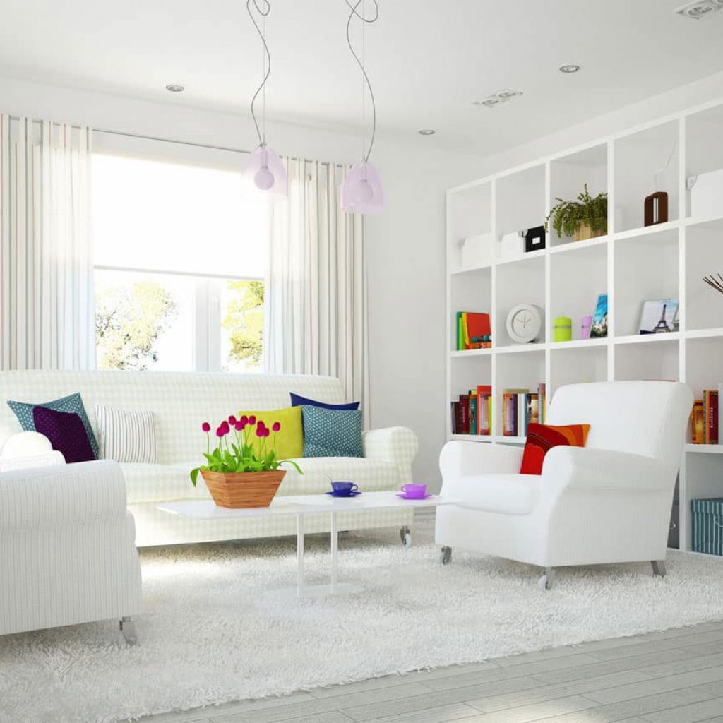
White color symbolizes clarity and freshness. It is a great color for meditation. White is a great color for the walls but it should be tidy and vivid one.
I suggest not to use too sharp a white because, if it looks untidy and muted it might affect your emotions. You can use shades whites for the floorings, laminates, window coverings etc. This color always looks elegant, refreshing and stylish when used aptly in interiors. Remember the mantra, “neither too much and nor too less, just perfect.” It is a great contrast to every color in the color wheel. No wonders it is one of the favorite colors of the designers. White is available in various shades too. Ivory, cream, off white, milky white, snow white and so on. Advisable is to use these white shades along with a small amount of darker colors to make your space look interesting and to say the story. It is important to keep in mind that usage of this color has to be according to your mood requirements. Whites with blues and greys will be a misfit if you are looking for a warm and cozy space. Instead, you can use whites with shades of browns like coffee, terracotta and woods etc. the combination of these colors will immediately lift your space from a dull to cozy setup. In the same way if you are looking for a space to relax and meditate the warm colors like yellows, oranges reds etc. are not suggested as these colors rejuvenate your energy levels. White reflects the sun rays and visually expands the space hence making the room look vivid, open and spacious.

There is so much more to talk about colors but I hope this blog helps you understand the colors and their impact on our temperament in a better way. Do let us know through comments on how you liked reading this blog. Stay creative and be blessed dear readers.
Bharati Perugu

